


前端开发
430
今天我将使用HTML,CSS和JavaScript做一个个性化的登录界面
我们先来看看运行的结果:
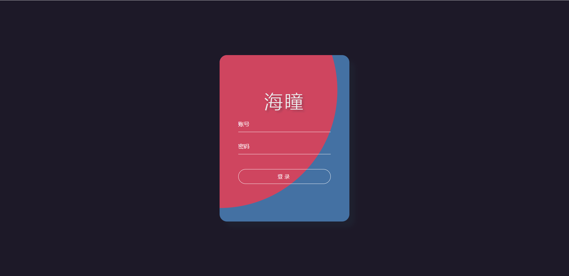
注意:我在本文中只会简介有些重要的代码,因为我们不是在写代码而是在写博客。
第一步
先在桌面建一个.html文件,.html前面名字可以以你们的风格来写,这里我就用index.html来演示。这次代码可以把CSS+JavaScript放在HTML文件里面。 我们先从index.html讲起,我们先把HTML基本代码写出来。
<div class="container"> <h1>海拥 | 海瞳</h1> <form action=""> <input type="text" class="tbx" placeholder="账号"> <input type="password" class="tbx" placeholder="密码"> <input type="submit" class="sub" value="登录"> </form> </div>
你们万万想不到,在本次分享的代码了,html就这么多。
CSS代码:
*{ margin:0; padding:0; } body{ /* 设置body高度为100%窗口高度 */ height:100vh; /* 弹性盒子模型 */ display: flex; /* 限免两个属性是让body里的子类居中 */ justify-content: center; align-items: center; background-color: #1d1928; } .container{ display: flex; justify-content: center; align-items: center; flex-direction: column; width: 350px; height: 450px; border-radius: 20px; background-color: #4471a3; /* 盒子阴影 */ box-shadow: 15px 15px 10px rgba(33,45,58,0.3); overflow: hidden; position:relative; } .container form{ width: 350px; height: 200px; display: flex; justify-content: space-around; flex-direction: column; align-items: center; z-index: 1; } .container form .tbx{ width: 250px; height: 40px; outline: none; border: none; border-bottom: 1px solid #fff; background: none; color:#fff; font-size: 15px; } /* 设置文本框提示文本的样式 */ .container form .tbx::placeholder{ color: #fff; font-size: 15px; } .container form .sub{ width: 250px; height: 40px; outline: none; border:1px solid #fff; border-radius: 20px; letter-spacing: 5px; color:#fff; background: none; cursor: pointer; margin-top: 20px; } .container h1{ color: #ecf0f1; font-size: 50px; letter-spacing: 5px; font-weight: 100; /* 文字阴影 */ text-shadow: 5px 5px 5px rgba(33,45,58,0.3); z-index: 1; } /* 设置鼠标进入的样式 */ .container .in{ position: absolute; top:0; left:0; display: block; width: 0; height: 0; border-radius: 50%; background: #cf455f; transform: translate(-50%,-50%); /* 使用in动画,持续0.5秒,缓出的时间函数,停留在最后一帧 */ animation: in 0.5s ease-out forwards; } /* 设置鼠标离开的样式 */ .container .out{ position: absolute; top:0; left:0; display: block; width: 1200px; height: 1200px; border-radius: 50%; background: #cf455f; transform: translate(-50%,-50%); /* 使用out动画,持续0.5秒,缓出的时间函数,停留在最后一帧 */ animation: out 0.5s ease-out forwards; } /* 动画 */ /* 设置鼠标进入时,元素的动画 */ @keyframes in{ /* 初始关键帧 */ 0%{ width: 0; height: 0; } /* 结束关键帧 */ 100%{ width: 1200px; height: 1200px; } } /* 设置鼠标离开时,元素的动画 */ @keyframes out{ /* 初始关键帧 */ 0%{ width: 1200px; height: 1200px; } /* 结束关键帧 */ 100%{ width: 0; height: 0; } }
我们写完HTML+CSS代码运行效果如下:
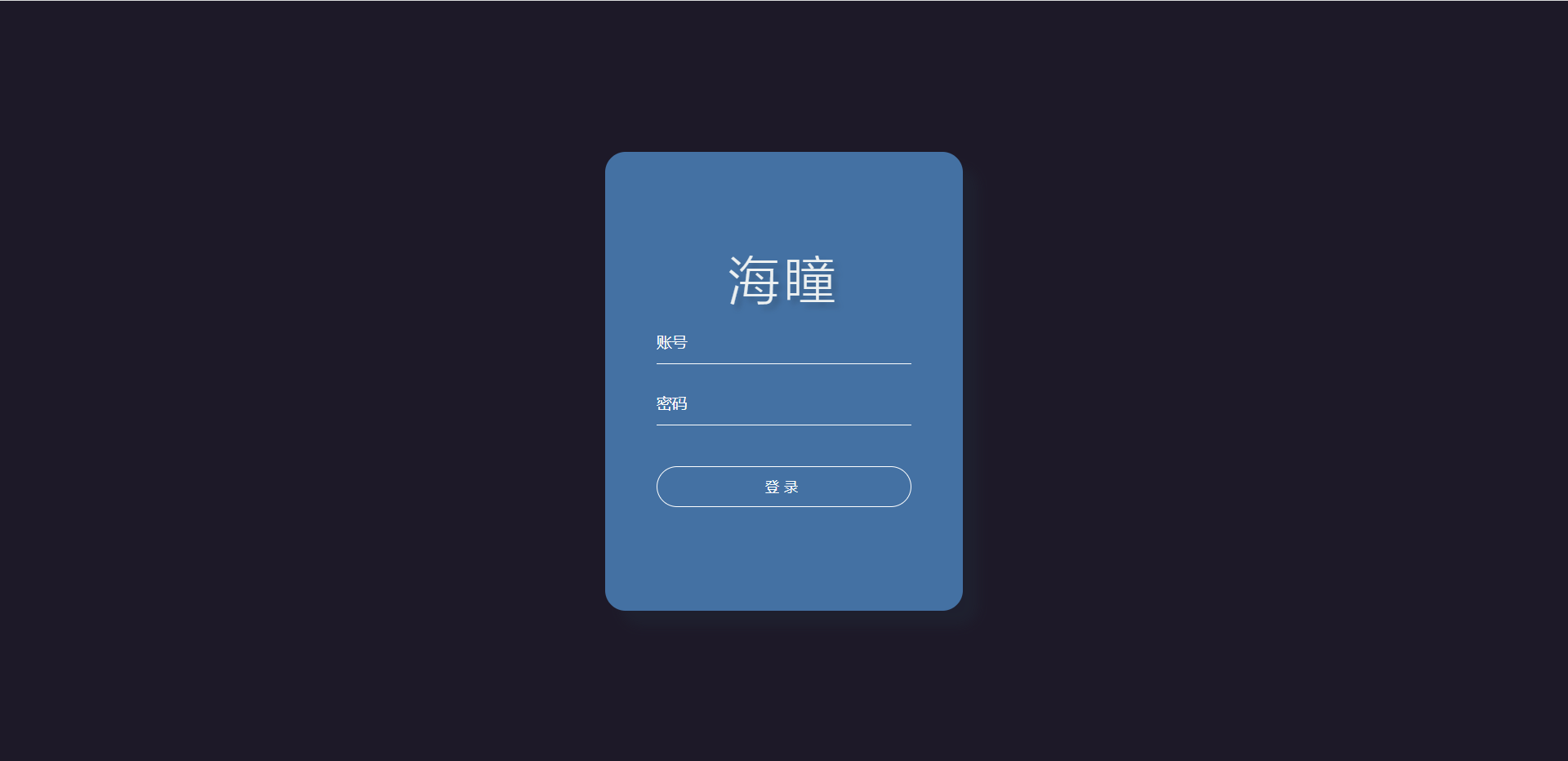 我们就已经用HTML+CSS把基本框架出来了。这个没有加Javascript,所以他说静态的。
由于主要代码在JavaScript代码也比较多,我就不传上JavaScript代码,想要代码的可以加我微信,微信号y27724611159要取代码,不收任何费用,全部免费。
广告